EMAIL EXPERIENCE

Welcome

We’ve found welcome emails 86% more effective than standard email marketing
Create a cohesive welcome sequence from end to end
First impressions count. A visitor's initial experience with a brand sets the tone for the rest of the relationship. Done poorly, a welcome campaign could end the relationship before it’s even begun. Handled well, it builds trust and accelerates that visitor's journey through the marketing funnel. We’ve found welcome emails 86% more effective than standard email marketing, averaging open rates of 50% and click rates five times higher than standard campaigns at 14%. Our evaluation of brands' welcome experiences showed mixed results. Welcome emails were ubiquitous, with 84% of brands sending them, but communication workflows were often disjointed. Brands often failed to correlate newsletter signups with account creation. Subscribers would get separate emails from the company acknowledging their subscription to the newsletter and their new account. It makes it look as though one part of the company doesn't know what the other is doing and undermines the concept of a single brand voice. Brands can use their welcome emails as an opportunity to offer consumers a newsletter subscription if they’re not already subscribed. This will help create relevant and consistent welcome emails. Coordinated emails reassure the subscriber that their future experiences with a retailer will be friction-free.
“Welcome emails were ubiquitous, with 84% of brands sending them, but communication workflows were often disjointed.”
Some points to consider in welcome emails include:

Personalization Personalize the email using information gathered during the signup process.

Clear CTAs Offering a single clear next step (such as signing up for a customer account if they don't yet have one, or updating their preferences) will keep a recipient engaged.

Use offers One useful approach is to include an offer in your welcome email. This boosts revenues by up to 30%.


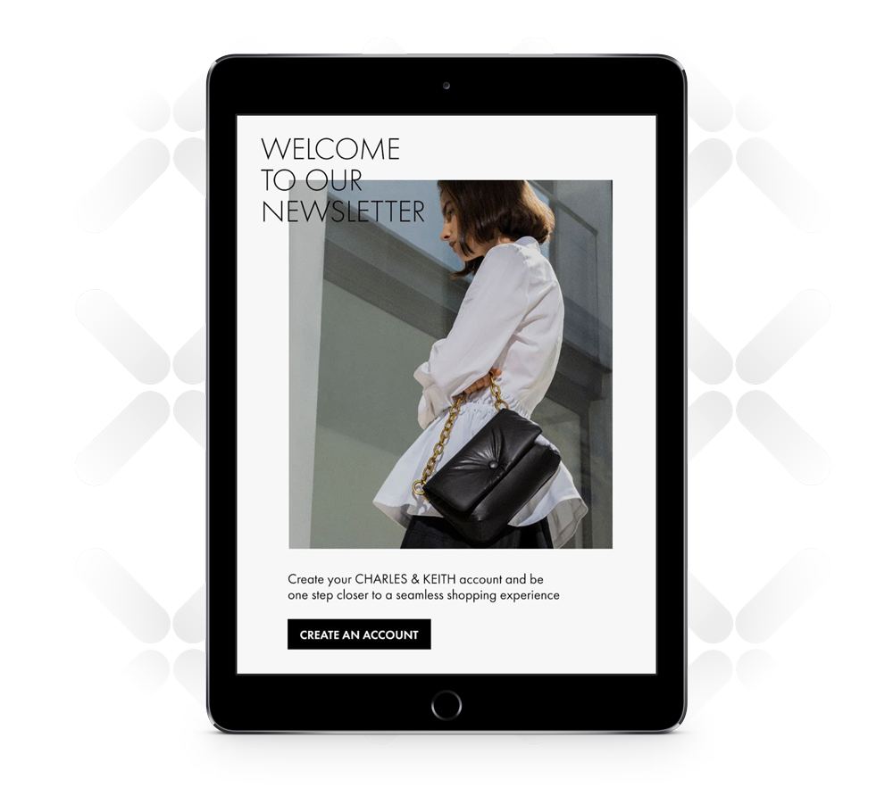
Charles & Keith used a thoughtful welcome email to create a cohesive experience between newsletter signup and account creation. It used eye-catching design in its welcome email acknowledging a new newsletter signup. The email also included a link inviting the subscriber to create a full account with the company.

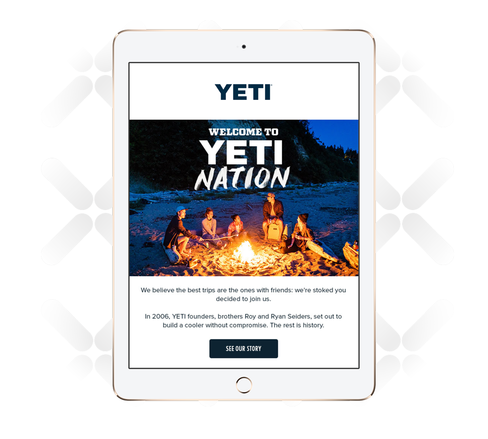
In its welcome email, Yeti identified subscribers as part of "Yeti Nation" in a headline that supported the brand and created an immediate sense of community. It followed this up with a link to the brand's story, further inviting the recipient to deepen their relationship with the company.

