EMAIL EXPERIENCE

Overall email design

Only 48% of brands used GIFs or dynamic images within their emails
Elevate design elements to boost visual appeal and performance
Visual appeal is important in email marketing campaigns, because readers respond to appealing visual components and layouts. Modern web technologies give marketers a host of options to capture the recipient's attention, including dynamic images that move on screen, and powerful button-based prompts to compel action. But are companies using these techniques? We found that businesses were not taking enough advantage of these opportunities. For example, only 48% of brands used GIFs or dynamic images within their emails. At 54%, slightly more used both CTA buttons and text-based CTAs to prompt action.
The most successful visual work came from brands that found innovative ways to integrate their editorial content with their visual design, creating a seamless experience for the reader. They paid extra attention to particular design elements. These included:

Text readability Size, spacing, color, and font choices all play a part in creating appealing text that is not only easy on the eyes, but visually attractive. Recipients should feel drawn to read the text they see.

Email structure A wall of dense text with no images makes emails dull and hard to understand. Breaking up text with bullets and boxes helps to make an email more digestible, as does positioning it alongside images.

CTA buttons and text A call to action is a great way to guide busy, distracted users through your email to the point where they take a definitive step, whether that’s visiting a product page, creating an account, or signing up for a newsletter. Marry these with buttons that provide a clear visual indicator of what that step should be.

Multimedia Animated GIFs make humorous or quirky messaging more impactful. They're a useful way to communicate a brand's personality and reach recipients on a more personal level. Embedded videos enable a brand to inspire and educate, complementing text while providing a whole new dimension for email recipients.
EXPERT COMMENTARY:

The key here is balance. Filling your email campaigns with promotional text is not advised, nor is using one huge image with no ALT text. Both may trigger spam filters. Email marketers should prioritize engagement via personalized image-based content, whilst also ensuring their campaigns are over the 500 character threshold.


Ritual took a smart approach to its email campaigns, using GIFs to help showcase the Ritual journey for customers. Its use of dynamic images in its communications helped to set its emails apart from others.

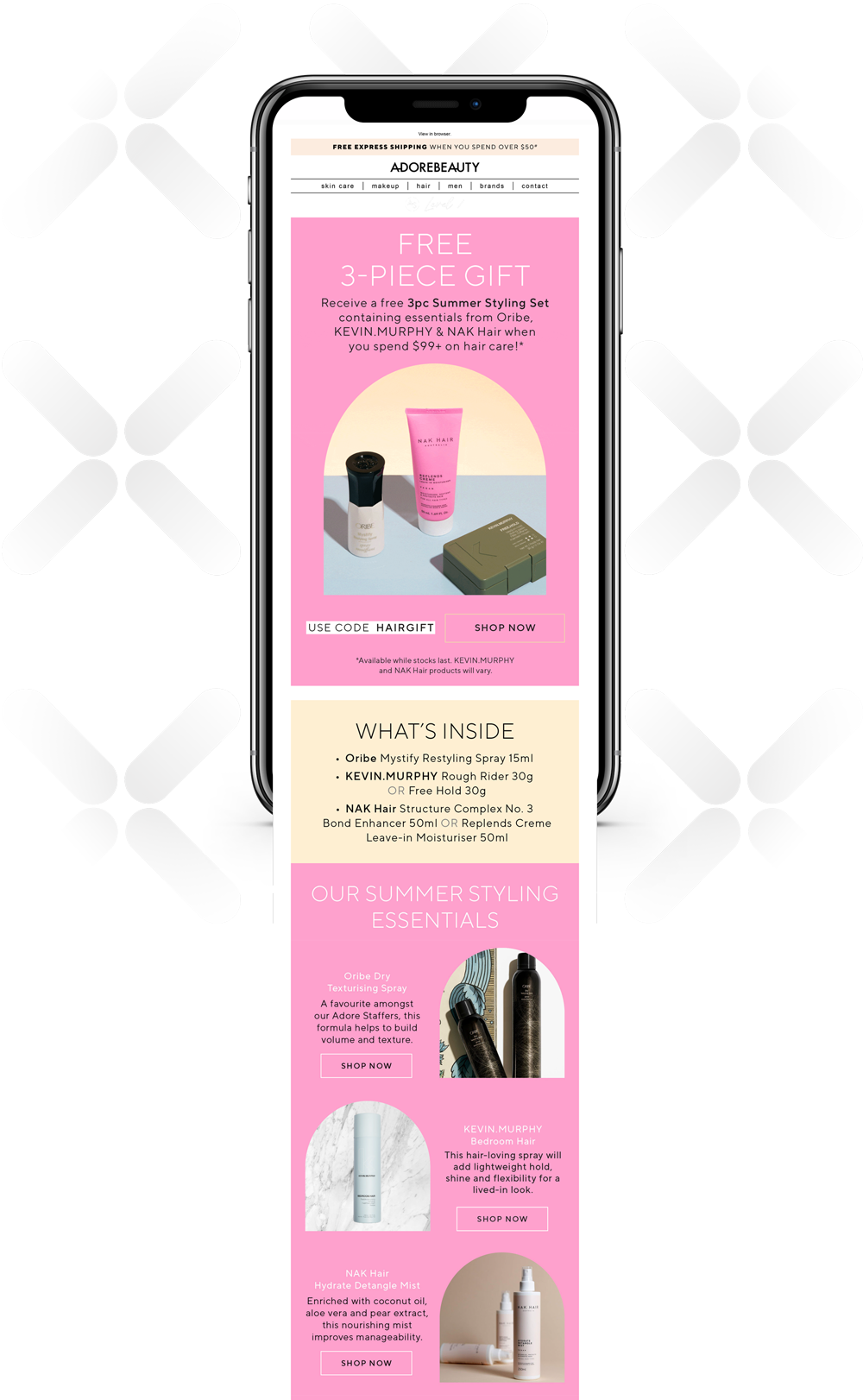
Adore Beauty focused on CTAs and GIFs to create a compelling experience for email recipients. Artfully-framed images combined with a strong offer proposition and a CTA embedded directly into a button turned a simple email into a powerful sales tool.

