CUSTOMER EXPERIENCE

Payment experience

Balance ease-of-checkout with positive friction
The checkout page is a pivotal point in the online shopping experience. It's here that customers will finally commit to making a payment or abandon their cart due to some unexpected hiccup. Retailers that craft a smooth, reassuring experience with all the options that a customer needs will see lower cart abandonment rates.
EXPERT COMMENTARY:

Abundant choice, channels, technological advances, and rising customer demands mean that consumers are constantly on the lookout for simpler, swifter, and smoother ways to shop. It also means that they’re far more likely to bounce between brands and merchants, swayed by convenience and experience rather than loyalty.
Payment choice
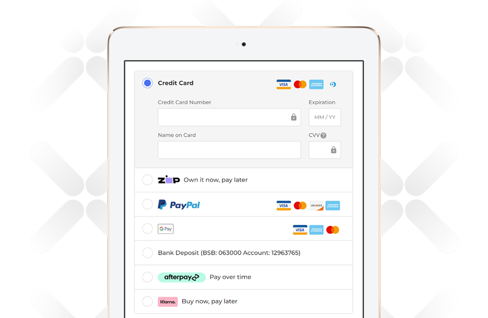
Retailers shouldn't overlook payment choice as a key differentiator at the checkout. Nearly 85% of brands provided alternative payment methods to traditional credit cards. PayPal was an especially popular option. Brands also innovated with pay-later solutions. These were the next most popular payment alternative after PayPal, with Klarna and Afterpay the most common. APAC retailers often opted for more region-specific solutions such as humm.
Nearly 85% of brands provided alternative payment methods to traditional credit cards
Those offering wrapping and gift message options will stand out from the competition with a tailored experience for gift shoppers.
Shipment options
Smart retailers also anticipate and accommodate the different motivations for a customer purchase. Gift options are a good example. Most brands offered the option to separate shipping and billing information, which is a start, although some brands such as Ritual did not. That is understandable from a security perspective because it makes fraud more difficult; however, it can impact the gift purchasing experience. Few of those that did allow separate billing and shipping addresses supported gifts as an explicit option at checkout. Those offering wrapping and gift message options will stand out from the competition with a tailored experience for gift shoppers. Brands can reduce friction at the checkout by prepopulating addresses. Some brands auto-saved addresses entered during the first purchase and used that information automatically in the future. Providing an easy way to substitute another choice makes this a useful way to speed along a purchase.
Delivery options
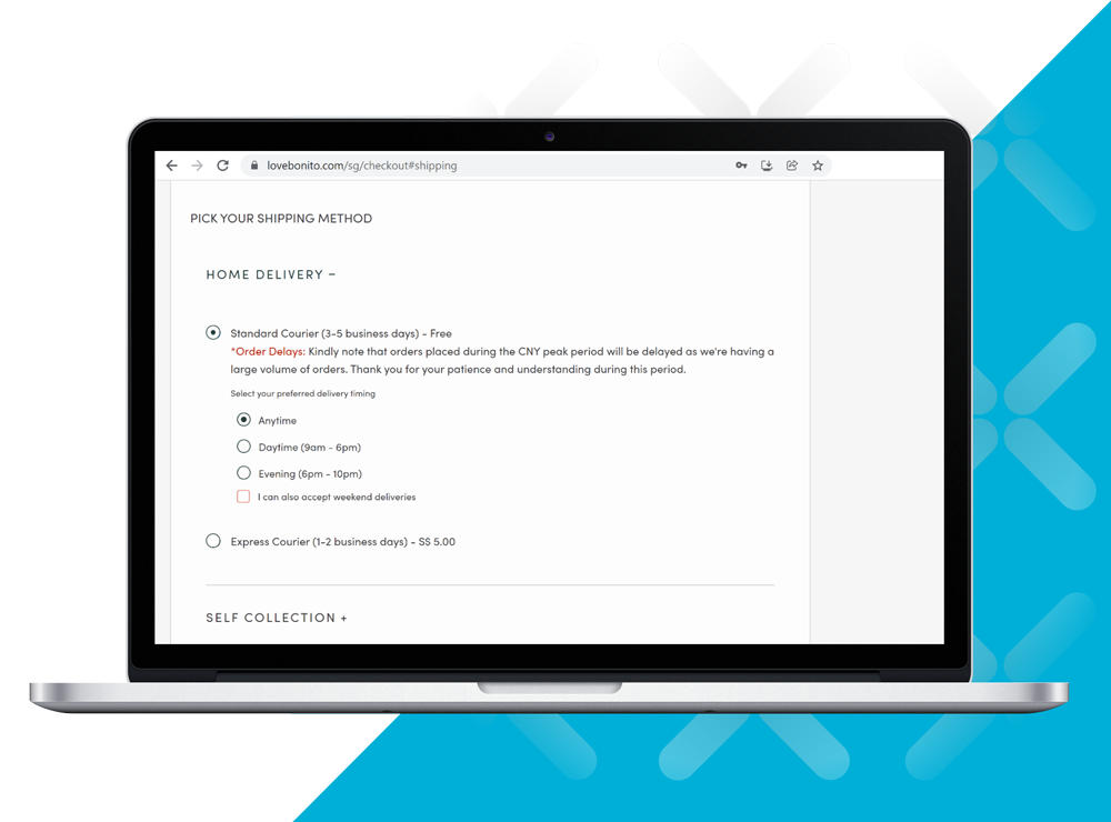
The final way to make things more convenient for the user at checkout is to offer a range of delivery options. Most brands have progressed beyond basic shipment options, but some stood out more than others. For example, Oak Furniture Land allowed customers to choose a delivery time window and leave additional delivery instructions.

Help customers make the right choice
Frictionless purchases have always been the holy grail in ecommerce, but as conditions change, a maturing industry is giving more thought to how customers make their choices. Forward-thinking retailers are considering how two years of pandemic living has changed consumption habits, and how this might shape a more mindful longer-term approach. As customers give more thought to their purchases during the selection process, some ecommerce workflows are gradually moving beyond a rush to payment to support this reflection along the way. Home goods retailer Bunnings exemplified this approach using live chat. The company monitored customer sessions that showed items held in carts beyond a given time threshold. After a certain time, it offered to begin a conversation with a product expert to help answer the customer's questions before officially checking out.


Adore Beauty concentrated on reducing payment friction not only on the checkout page but on individual product lists. Its use of Klarna, Zip, and Afterpay covered pay-later and installment-based options, making purchases more attractive to customers.

Love, Bonito increased customer convenience by allowing people to specify preferred delivery time windows, making it easier to plan for delivery of goods.

